What are you missing?
Good, even great design can be hidden in plain sight. It can go unnoticed and that’s actually a positive. Unsettled and confused is a terrible way to leave the viewer of any message, especially if the viewer doesn’t know why. If a potential customer can’t put a finger on why he/she feels this way it’s a worst-case scenario, for a business trying to create sales and earn the public’s trust in their brand. Design is important; it has to ‘work’ to work for your business.
The quote, ‘For most of us, design is invisible, until it fails.’ from designer, Bruce Mau, is relevant, especially regarding logo design. ‘Design is the silent ambassador of your brand.’ says Paul Rand, art director, graphic designer, and renowned logo designer.
This is spot on!
Advertisement
Is your business life FUN – or stressful?
Our Strategies Subscription will help you easily beat the competition, enhance your profits and have more FUN.
Get access to three strategies at no charge by clicking here or on the image below.
When designs offer hidden elements and meanings, the result can be extraordinary! These ‘Easter eggs’ can be seen quite a bit in logo design.
One of the most famous hidden elements is the arrow created in the negative space between the “E” and “X” in the FedEx logo. People may not see this at first, but it’s definitely there. Once the hidden arrow is found, it is an “aha moment” for the viewer, and the graphic designer deserves kudos, for taking creativity one step further.
Great design catches your eye and keeps it there; to create more than just a passing glance. Typically, these surprises not only leave a great feeling and impression, but also pique viewers’ interest prompting them to want to learn more. For brands, this extra interest can be incredibly beneficial!

Advertisement
Is your business life FUN – or stressful?
Our Strategies Subscription will help you easily beat the competition, enhance your profits and have more FUN.
Get access to three strategies at no charge by clicking here or on the image below.
Another example of a great logo design with a hidden meaning, in plain sight, is Tostitos. The visual of two people sharing a chip above a bowl of salsa is created out of the letterforms in the brand name. It’s a positive visual representation of how Frito-Lay wants customers to consume the product: enjoying it together.

Interestingly, before children learn how to read, they can identify symbols and sight words. For example, a child knows what a stop sign is and its meaning, before he/she can actually sound out the word phonetically and read it. This emphasizes the impact of good logo design; it is clearly identifiable, even amongst the youngest viewers! As children grow older, they may discover a hidden surprise after repeated exposure to a logo.
There are at least a dozen common principles of design that serve to keep layouts in order and ‘feeling good,’ though, I emphasize five here. The viewer may not see these individually or even as a grouping of two or more, however, he/she typically notices when something is amiss.
Balance – is there symmetry to the design? Are the elements weighted properly?
Proportion – is there alignment in the size of the graphic elements, or does something seem ‘off’?
Advertisement
Is your business life FUN – or stressful?
Our Strategies Subscription will help you easily beat the competition, enhance your profits and have more FUN.
Get access to three strategies at no charge by clicking here or on the image below.
Contrast – this is what makes design elements stand out. Contrast gives color and value its impact, e.g., black vs. white, or complementary color pairs like blue vs. orange.
Hierarchy – is there an order to the design?
Unity – do all the design elements work together harmoniously?
Two of my most successful logo designs are on different ends of the business spectrum. Defiant Services offers legal, financial, tax and insurance advisement. Their logo, a triangle which has the letters “D” & “S” hidden within it, is set inside two circles. To one viewer, the logo may look like a shield signifying protection, which is my client’s goal. To another, it may resemble a compass, which symbolizes Defiant’s role as a Life Planning Pathfinder.

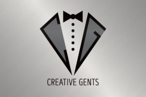
The other logo, Creative Gents, is the title of an art show, not a business service. It conveys being distinguished, strong and masculine with a touch of class. The “C” and “G” initials are hidden on each lapel of the tuxedo jacket.

Although Defiant Services and Creative Gents are very different: one an objective business and the other a subjective art show, the bottom-line target of the designs is the same. Each client wants to draw the attention of the viewer and ignite a desire to know more, make contact, and ultimately become a client/patron. Once customers are on board, logos serve as symbols and consistent reminders of each brand’s values and mission.
Both logos of Defiant Services and Creative Gents utilize the basic principles of design, mentioned earlier. Their designs and hidden elements ‘work’ both graphically and by achieving the clients’ goals.
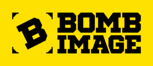
Lastly, the logo design for BOMB Image, my branding and marketing firm, has hidden elements. Can you identify them? Hint: those aren’t ordinary photo mounting corners surrounding the “B.”
If you want to know if your answer is correct and/or want to learn more about great design with hidden elements, please reach out.

Brian Butkowski is the Owner of Bomb Image as well as Brand Advisor & Designer. He makes it easier for clients to deliver the right message to their customers, by Demystifying Branding & Marketing. Because of this, his clients gain better connection and engagement with their customers – which results in greater revenue.
With over two decades of experience guiding small businesses, Brian plans, produces, and executes tactics that utilize clients’ brands, logos, and messaging. He prides himself on being an objective facilitator, utilizing proven processes to draw out clients’ “right answers,” to achieve their branding and marketing goals.
Related Articles
Health Is Wealth
September 13, 2023
A Successful Marketing Budget?
July 7, 2023
That’s A BAD Idea!
June 12, 2023
Does Branding Really Matter?
May 31, 2023
Reinvent and Reimagine
May 4, 2023
Uncovering The Secrets of Color
May 3, 2023


